- 6061 Dale Street - Suite G Buena Park, CA 90621
- Request A Quote
We’re open and ready to help you grow your business – Click Below or Call for a Quote!
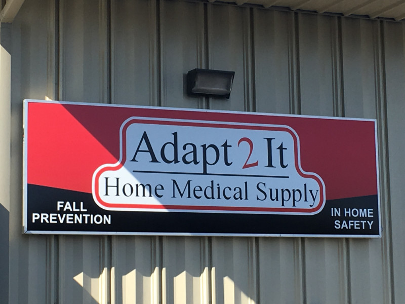
Adapt 2 It Home Medical Supply took over a former mattress store location to expand its business. Signage was no problem since the prior retailer left two cabinet signs and one double-sided pylon sign behind. But the company’s management team knew that it needed help with revamped illuminated sign panels in Costa Mesa, CA. This was when we got the call to come and assist.
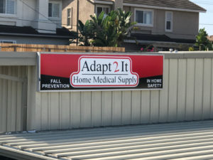
Turn your signage colorful with new sign facings!
Because the venue’s prior tenant left behind sign cabinets in excellent shape, the switch of the sign panels was quick and easy. We worked with the company to create an eye-catching display with its logo that needed a little more pizzazz to fill up the landscape-shaped signage. To achieve this goal, we added a red and black background that acts as immediate eye candy.
It grabs the attention of passersby and motorists, which heightens the signage’s wayfinding functionality as well as its marketing and branding abilities. We added a couple of bullet points to provide a niche explanation of Adapt 2 It Home Medical Supply’s services and products. Now, it is impossible to overlook the presence of the business. Also, prospective customers know exactly what the business does.
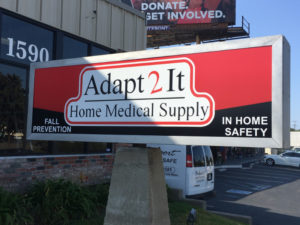
We also added new graphics to their pylon sign!
For this client, we added some bullets to the new sign facings. However, this practice is not reserved only for building signs or monuments. Our experts have worked with other business owners who asked us to incorporate niche explanations in vehicle wraps, banners, window graphics, and interior signage. In fact, there are several advantages to this practice.
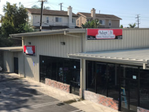
Vibrant to see on all sides!
If you are relocating to the city or want to redo the look and feel of the signage you have, contact our graphic artists for assistance. We work with you to present your brand message and catch the attention of passersby. Call us today to learn more about your options.
